Kho Prompt
Bắt đầu bằng một câu lệnh tốt.
Khám phá, điều chỉnh và sao chép prompt phù hợp với công việc. Luôn kiểm tra lại kết quả AI trước khi sử dụng.
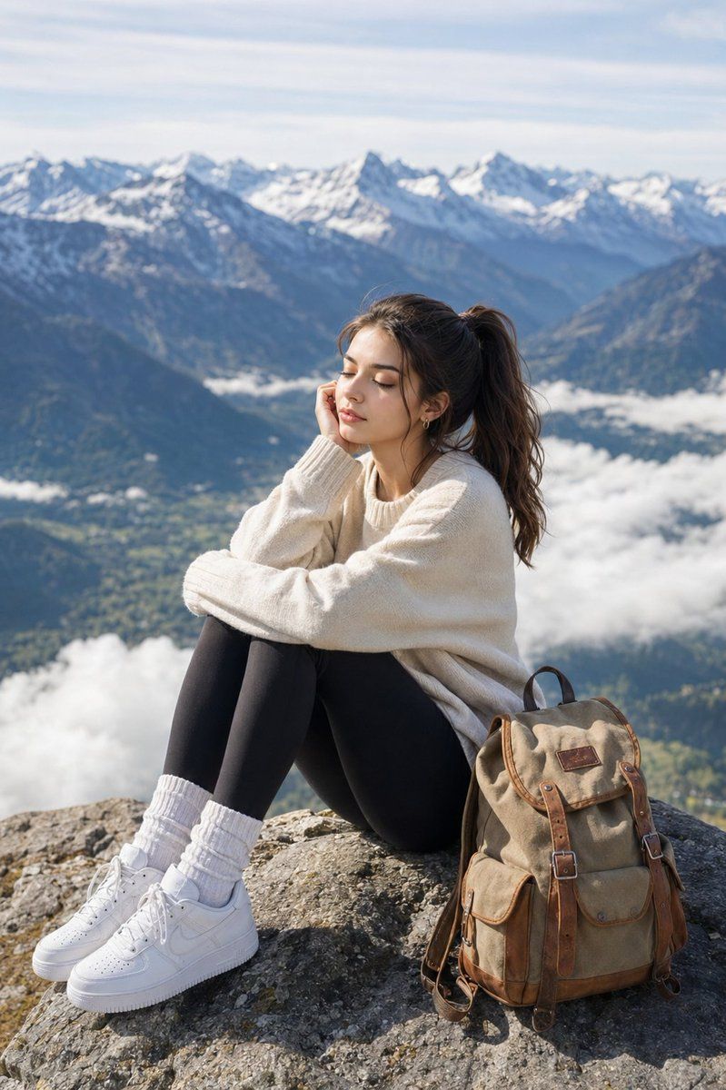
A photorealistic, high-resolution lifestyle photograph of the same young woman with brown hair styled in a high ponytail, wearing a light cream-colored sweater, dark leggings, thick white socks, and white sneakers, sitting on a high rocky mountain peak overlooking a vast, breathtaking alpine valley with snow-capped peaks in the background. In the composition, she sits in profile with her knees tucked up, leaning her head on her hand with her eyes closed in a peaceful, serene expression as she enjoys the fresh mountain breeze, accompanied by a vintage canvas backpack with leather straps resting on the rock beside her. The lighting is bright and natural daylight with soft clouds drifting below, and the shot is captured from a slightly elevated angle with a shallow depth of field that keeps the traveler sharply in focus while softly blurring the magnificent distant mountain ranges.

Create a completely original 9:16 vertical lifestyle travel photograph inspired by the overall concept of two young friends posing playfully on a winding countryside road surrounded by open green fields and distant mountains. Scene: Two different young adult women traveling together in a peaceful mountain countryside. One woman is standing casually near the road, while the other is slightly crouching/leaning toward the camera with a playful travel-photo pose. Natural friendship energy, spontaneous vacation moment, relaxed smiles. Environment: A wide winding asphalt road through golden-green grasslands, rolling mountains in the background, scattered wildflowers, a few distant horses and cows, soft morning mist, small trees along the hills. Completely different landscape composition from the reference. Characters: Two new-looking female characters with distinct facial features and hairstyles. Woman 1: shoulder-length dark brown hair, beige knit sweater, olive-green cargo pants, cream sneakers, small navy crossbody bag. Woman 2: long wavy dark hair, mustard-yellow oversized jacket, light blue wide-leg jeans, white sneakers, small brown backpack. Pose & composition: Full-body vertical composition. The women are positioned at different depths on the road, creating natural perspective. One casually walking while looking back at the camera, the other standing slightly sideways and laughing naturally. Candid travel photography rather than a staged fashion shoot. Visual style: Photorealistic smartphone travel photography, authentic human proportions, natural skin texture, subtle imperfections, realistic fabric, realistic hair, natural daylight, soft overcast sky, slightly muted earthy colors, documentary vacation aesthetic, believable depth and perspective. Camera: 9:16 vertical frame, eye-level smartphone camera, 28mm equivalent wide-angle lens, natural perspective, sharp subjects with realistic background detail, subtle photographic grain, no cinematic color grading.
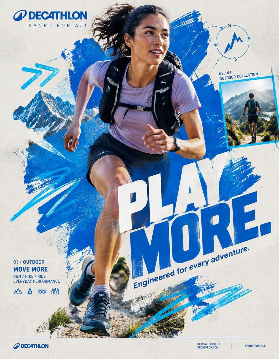
QUECHUA — “PLAY OUTSIDE.” BEHANCE-LEVEL DIGITAL COLLAGE CAMPAIGN FORMAT Ultra-Premium QUECHUA Outdoor Campaign Key Visual Vertical 4:5 Instagram Hero Creative Behance Front Page Quality Global Outdoor & Hiking Campaign Senior Social Media Art Direction Contemporary Outdoor Photography × Handcrafted Digital Collage × Editorial Graphic Design 8K UHD Hyper-Realistic Outdoor Photography High-End Editorial Art Direction Print-Quality Graphic Execution Premium Commercial Adventure Campaign Strong Visual Storytelling Tactile Mixed-Media Aesthetic Zero AI Slop Zero Generic Hiking Advertisement Zero Stock-Photo Feeling Zero Influencer Travel Aesthetic Zero Corporate Catalogue Layout Zero Luxury-Adventure Copycat Zero Random Graphic Decoration The final artwork must feel deliberately designed by a senior art director and assembled by a professional digital collage artist — not generated as a collection of unrelated elements. CREATIVE CONCEPT CAMPAIGN: “PLAY OUTSIDE.” CORE MESSAGE: THE OUTDOORS BELONGS TO EVERYONE. The campaign celebrates the instinct to leave the ordinary behind. A trail after work. A mountain on the weekend. A cold morning hike. A sudden change in weather. A long walk with friends. A place you have never explored before. Quechua becomes the equipment that makes everyday exploration possible. The visual should communicate: EXPLORATION FREEDOM DISCOVERY ADVENTURE MOVEMENT RESILIENCE COMMUNITY OUTDOOR LIFE The campaign should feel: AUTHENTIC ADVENTUROUS YOUTHFUL RAW OPTIMISTIC HUMAN ENERGETIC ACCESSIBLE ART DIRECTION Think: QUECHUA × OUTDOOR EDITORIAL × MOUNTAIN JOURNAL × HANDCRAFTED POSTER × TOPOGRAPHIC MAP × CONTEMPORARY DIGITAL COLLAGE The artwork should combine highly realistic outdoor photography with visibly handmade graphic interventions. The contrast is essential: REAL HUMAN + REAL OUTDOOR ENVIRONMENT + REAL QUECHUA PRODUCT + HANDMADE GRAPHICS + TOPOGRAPHIC INFORMATION + EDITORIAL TYPOGRAPHY Do not make the environment look like an artificial fantasy landscape. The mountain must feel physically real. The weather must feel real. The clothing must look genuinely functional. The person must look like someone who actually hikes. Introduce controlled imperfections: rough paper edges hand-painted marks topographic contour lines slightly misregistered ink screen-print texture cut-paper shapes field-note markings visible paper fibers analog grain subtle photocopy texture These imperfections should feel intentionally art-directed. Never messy. Never amateur. PHASE 1 — HERO PHOTOGRAPHY SUBJECT: One energetic everyday outdoor explorer. Age: 20–30. Gender: Auto select based on strongest visual composition. Casting: Contemporary global and diverse. The person must look like a genuine Quechua customer rather than a fashion model. Natural facial structure. Natural skin texture. Realistic body proportions. Practical outdoor appearance. No influencer aesthetic. No luxury travel aesthetic. No expedition-superhero styling. EXPRESSION: Focused. Curious. Confident. Natural. A subtle authentic smile or concentrated expression. The emotion should communicate: “I WANT TO SEE WHAT IS AROUND THE NEXT CORNER.” ACTION Capture the subject at the absolute peak of outdoor movement. Preferred actions: HIKING UPHILL TRAIL RUNNING CROSSING A ROCKY RIDGE CLIMBING A STEEP TRAIL WALKING THROUGH A FOREST JUMPING ACROSS A SMALL STREAM DESCENDING A MOUNTAIN PATH TREKKING THROUGH LIGHT RAIN Choose ONE action with the strongest silhouette. The action must create a powerful diagonal. The body should naturally travel from: TOP LEFT toward BOTTOM RIGHT. The terrain should reinforce the movement direction. Capture authentic physical effort. Boots should interact naturally with rocks, soil or trail surface. Clothing should react naturally to wind and movement. No impossible body positioning. No floating feet. No fantasy climbing. HERO PRODUCT ONE CLEARLY VISIBLE QUECHUA PRODUCT ONLY. Choose the product that best supports the selected adventure. Examples: QUECHUA HIKING JACKET QUECHUA BACKPACK QUECHUA HIKING BOOTS QUECHUA FLEECE QUECHUA RAIN JACKET QUECHUA TREKKING TROUSERS QUECHUA TENT The product must be unmistakably visible. Product placement should feel naturally integrated into the adventure. No floating product. No duplicate product. No product lineup. The hero product receives secondary visual emphasis after the explorer. Preserve accurate product construction: fabric stitching zippers buckles straps pockets waterproof details sole construction technical materials brand markings PHOTOGRAPHIC STYLE Premium editorial outdoor campaign photography. Authentic natural lighting. Documentary adventure energy. Real mountain atmosphere. Natural skin. High-resolution textile detail. Realistic terrain. Camera: SONY A1 II Lens: 85mm Aperture: f/2.8 Camera position: Slight low-angle hero perspective. Crop: 3/4 body or full body depending on action. The explorer must be isolated with an exceptionally clean professional cutout when required for the collage. Preserve: hair detail fabric edges hands boots backpack straps equipment natural movement No artificial cutout halo. No white outline. No excessive sharpening. PHASE 2 — COLOR FOUNDATION PRIMARY QUECHUA OUTDOOR BLUE Use a strong outdoor-inspired Quechua blue as the principal graphic accent. SUPPORTING COLORS: Off-white Warm stone grey Deep forest green The palette should feel connected to: mountain sky rock forest trail technical outdoor equipment Keep the graphic system controlled. Avoid excessive colors. PRIMARY PAINT FORM Create ONE enormous irregular outdoor-blue paint form. Occupy approximately: 45–55% of the composition. The shape should function as the visual foundation of the collage. Appearance: hand-painted thick brush texture organic edges dry-brush imperfections visible bristle marks slight transparency variations screen-print character paper interaction The paint should feel physically applied to recycled expedition paper. Not a smooth digital blob. Not a generic vector shape. The explorer should overlap the paint form. The product must remain completely visible. PHASE 3 — COLLAGE SYSTEM Introduce exactly five major handcrafted graphic elements. Select from: TOPOGRAPHIC CONTOUR LINES TRAIL ROUTE LINES HAND-DRAWN CIRCLES COMPASS SYMBOLS ALTITUDE MARKERS MOUNTAIN SILHOUETTES GPS COORDINATE MARKINGS ELEVATION GRAPHICS HAND-DRAWN ARROWS WEATHER SYMBOLS TERRAIN MAP FRAGMENTS HALFTONE DOTS FIELD-NOTE MARKINGS Each element must have a visual purpose. Do not scatter graphics randomly. Graphics should reinforce: direction altitude location distance terrain exploration Use asymmetric placement. Create a strong diagonal rhythm. Some elements may pass behind the explorer. Some may partially disappear beneath typography. One or two graphic elements may overlap the subject subtly to create physical depth. MATERIAL LANGUAGE Build the collage as though physically assembled from an explorer’s field notebook. Include subtle: torn-paper edges folded map fragments screen-print texture photocopy artifacts ink bleed dry-brush marks recycled paper fibers topographic printing handwritten route markings subtle registration offsets analog grain The artwork should feel tactile. It should resemble: A MOUNTAIN MAP AN OUTDOOR MAGAZINE A HANDMADE ADVENTURE POSTER. Do not overdo the texture. PHASE 4 — TYPOGRAPHY PRIMARY HEADLINE: PLAY OUTSIDE. Make this the second-largest visual element after the explorer. Large bold uppercase geometric sans-serif. Extremely strong weight. Tight leading. Compact composition. Minimal tracking. Allow a slight 2–4° rotation. The typography should feel physically printed onto the artwork. Not floating. Not glossy. Not 3D. Not futuristic. Typography should interact with the collage. Allow: partial cropping layer overlap masking paint interruption map-line interruption edge cropping PRIMARY COPY: PLAY OUTSIDE. SUPPORTING COPY: Built for whatever the trail brings. Keep supporting copy small and highly readable. TYPOGRAPHIC HIERARCHY 01 QUECHUA BRANDING 02 PLAY OUTSIDE. 03 Built for whatever the trail brings. 04 TRAIL / ALTITUDE / ADVENTURE INFORMATION 05 DISCOVER MORE The headline must remain instantly readable even at Instagram thumbnail size. PHASE 5 — QUECHUA BRANDING Place the official QUECHUA branding in the upper-left. Preserve: correct proportions clear space accurate wordmark brand integrity Do not distort. Do not stretch. Do not place the logo inside unnecessary effects. Small supporting line: OUTDOOR EQUIPMENT The branding should remain visible but should not compete with: PLAY OUTSIDE. PHASE 6 — BACKGROUND BACKGROUND COLOR: Warm Light Stone Grey The background should resemble premium recycled expedition paper. Add extremely subtle: paper grain recycled fiber analogue noise soft printing imperfections faint topographic texture Texture opacity: Below 15%. The background must remain visually quiet. The energy comes from: THE EXPLORER THE TERRAIN THE PAINT FORM THE TOPOGRAPHIC GRAPHICS. PHASE 7 — COMPOSITION MODEL POSITION: Off-center. Never dead center. Place the explorer slightly toward the visual intersection of the composition. NEGATIVE SPACE: Approximately 18%. Allow breathing room around the major elements. LAYER ORDER: 01 BACKGROUND 02 PAPER TEXTURE 03 TOPOGRAPHIC MAP FRAGMENTS 04 PAINT FORM 05 HANDMADE GRAPHIC ELEMENTS 06 EXPLORER PHOTOGRAPH 07 PRODUCT 08 TYPOGRAPHY 09 MICRO INFORMATION 10 BRANDING 11 FOOTER The explorer should appear to physically exist inside the collage. MOVEMENT DIRECTION TOP LEFT ↓ MOUNTAIN RIDGE ↓ EXPLORER ↓ BOTTOM RIGHT The entire composition should feel as if it is moving toward an unseen destination. The eye should travel naturally: BRANDING ↓ HEADLINE ↓ FACE ↓ PRODUCT ↓ TRAIL ↓ CTA PHASE 8 — VISUAL DEPTH Create three distinct depth planes. BACKGROUND: Recycled paper, faint mountain forms and subtle map texture. MIDGROUND: Paint forms, contour lines, trail maps, compass graphics and altitude information. FOREGROUND: Explorer, product and typography. Some contour lines should disappear behind the explorer. Some typography should overlap the paint. One small map element should overlap the subject subtly. This creates the feeling of a physically assembled outdoor editorial collage rather than a flat AI composition. PHASE 9 — BRAND DNA The artwork must communicate Quechua’s core outdoor identity: ACCESSIBLE ADVENTURE EVERYDAY EXPLORATION HIKING OUTDOOR DISCOVERY PRACTICAL INNOVATION WEATHER READINESS COMFORT COMMUNITY NATURE MOVEMENT The explorer should never look like an untouchable professional expedition athlete. The campaign should make the viewer think: “I could go there.” That feeling is more important than displaying extreme athletic performance. PHASE 10 — INFORMATION DESIGN Introduce a small editorial information block. Example: 01 / MOUNTAIN TRAIL ALT. 2,480 M HIKING / TREKKING ALL-WEATHER EQUIPMENT DISTANCE / 08.4 KM Use tiny but perfectly legible typography. Create visual hierarchy through: scale weight spacing alignment Not through excessive colors. PHASE 11 — SECONDARY COLLAGE FRAME Introduce ONE small secondary photographic frame. Place it asymmetrically. Inside: A secondary outdoor adventure moment. For example: a small group of hikers crossing a mountain trail. Frame it with a thin outdoor-blue border. Add: 02 / 04 MOUNTAIN COLLECTION The secondary image must feel like part of a printed outdoor field journal. It should support the campaign narrative without competing with the hero explorer. PHASE 12 — FOOTER Create a minimal bottom strip. Include: QUECHUA DISCOVER MORE → OUTDOOR EQUIPMENT Use very small clean typography. Keep the footer extremely restrained. No sale banner. No clutter. PHASE 13 — GRAPHIC IMPERFECTION Introduce controlled imperfections characteristic of high-end physical outdoor collage: slightly uneven paint edges tiny ink inconsistencies subtle map displacement minor registration shift hand-drawn contour variation faint photocopy noise slight paper edge wear These details should make the artwork feel human-made. The composition must still feel extremely polished. Think: ART-DIRECTED IMPERFECTION. Not RANDOM IMPERFECTION. PHASE 14 — LIGHTING & IMAGE QUALITY The original outdoor photograph must retain premium commercial photography quality. Natural mountain sunlight. Strong directional light. Realistic atmospheric depth. Crisp highlights. Controlled shadows. Natural skin exposure. Detailed technical fabric. Realistic rock and vegetation texture. Sharp hero product. Natural environmental reflections. No artificial HDR. No plastic skin. No beauty retouching. No excessive clarity. No fake cinematic glow. No neon. No fantasy lighting. over-saturated landscape. PHASE 15 — FINAL ART DIRECTION The final visual should look like a real campaign artwork created by: A SENIOR SOCIAL MEDIA ART DIRECTOR A PROFESSIONAL OUTDOOR PHOTOGRAPHER A DIGITAL COLLAGE ARTIST A TYPOGRAPHER A MAP / EDITORIAL DESIGNER Every element should appear intentional. Every layer should have a purpose. The explorer should provide realism. The Quechua product should provide commercial relevance. The typography should provide communication. The mountain environment should provide emotion. The map graphics should provide exploration. The paint form should provide brand energy. The paper texture should provide physicality. The composition should provide movement. FINAL FEEL If: QUECHUA × A CONTEMPORARY OUTDOOR MAGAZINE × A HAND-PAINTED MOUNTAIN POSTER × A TOPOGRAPHIC FIELD JOURNAL × A MODERN GRAPHIC DESIGN STUDIO created one campaign together. The final result should feel: RAW. HUMAN. OUTDOOR. TACTILE. ADVENTUROUS. ACCESSIBLE. YOUTHFUL. EXPLORATIVE. REAL. Not a catalogue. Not a generic hiking advertisement. Not a luxury outdoor campaign. Not a travel-influencer post. Not a corporate retail graphic. Not an AI-generated mountain collage. A genuine Quechua campaign where: PHOTOGRAPHY + TERRAIN + PRODUCT + TYPOGRAPHY + TOPOGRAPHIC GRAPHICS + HANDCRAFTED COLLAGE become one visual system. FINAL GENERATION SPECIFICATION Vertical 4:5 8K UHD Hyper-realistic outdoor photography Sony A1 II 85mm f/2.8 Authentic human anatomy Natural skin texture Detailed technical outdoor apparel Accurate Quechua product construction Clean professional cutout Outdoor blue / off-white / stone grey / forest green Controlled graphic palette Hand-painted collage elements Topographic map graphics Recycled paper texture Editorial typography Asymmetrical composition Strong diagonal movement 18% negative space Premium commercial photography Contemporary digital collage Behance front-page art direction Instagram hero creative Print-ready finish High visual hierarchy High brand recognition ZERO AI SLOP
![【MAIN WORD】: [Main Word]
【SUBJECT】: [Subject]
【PRO](https://cdn.sanity.io/images/bmgjki4m/production/214cce4b0ad9a3b1389b79535eff3a231f14a579-675x1199.png)
【MAIN WORD】: [Main Word] 【SUBJECT】: [Subject] 【PRODUCT】: [Product] 【VISUAL EFFECT】: [Visual Effect] 【BACKGROUND】: [Background] 【PALETTE】: [Palette] 【TOP LEFT】: [Top Left] 【TOP RIGHT】: [Top Right] 【BOTTOM LEFT】: [Bottom Left] 【BOTTOM RIGHT】: [Bottom Right] 【FORMAT】: 9:16 vertical Create a premium fashion, beauty or lifestyle campaign poster using vertical sliced typography. Place 【MAIN WORD】 large at the center, occupying about 80–88% of the width. Keep it bold and readable at thumbnail size. Use the entire word as a photographic mask for one single continuous commercial photograph featuring 【SUBJECT】, 【PRODUCT】 and 【VISUAL EFFECT】. Keep the person and hero product clearly recognizable. Place the face, eyes and main product inside wider, more intact letter areas. Use one strong physical or optical effect—such as glossy liquid, rain, lens reflections, hard sunlight or flowing fabric—to connect the composition across the word. Keep roughly the upper 50–55% of the letterforms intact. Extend selected lower strokes downward into 4–6 varied sections for secondary details such as hair, clothing, reflections, shadows or environment. The same photograph must continue naturally through every letter and slice. Strict clipping rule: all people, products, hair, liquid, rain, reflections and other photographic elements must remain completely inside the typography. Nothing should cross into the outer negative space. Use a clean 【BACKGROUND】 with generous negative space, 【PALETTE】 for the photography, and a subtle soft shadow behind the type. Arrange supporting information: Top left: 【TOP LEFT】 Top right: 【TOP RIGHT】 Bottom left: 【BOTTOM LEFT】 Bottom right: 【BOTTOM RIGHT】 Use small, precise modern sans-serif typography. The final result should feel like a finished premium campaign, with strong thumbnail readability and one clear visual interaction between the subject, product and typography. Avoid broken faces, duplicated subjects, different images inside each letter, excessive slices, barcode-like strips, elements outside the type mask, heavy 3D effects, watermarks, numbering, Vol., No., sparkle symbols or four-point stars.
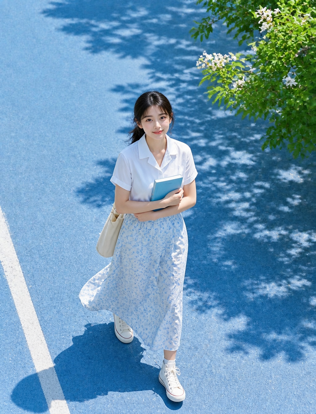
主体与人物 一位成年女性走在明亮的蓝色人行道上,全身构图,人物占据画面底部中央约35%。黑色中长发低马尾,薄刘海与脸侧碎发在微风中轻柔飘动。面部肤色明亮自然,双颊透出红润感,妆容为柔和自然的日系清透风格。神情自然,微微抬头看向镜头,呈现出夏季午后散步时偶遇的纯真可爱感。 服装与姿态 身穿白色短袖睡衣风衬衫,搭配淡蓝色碎花长裙,裙摆采用轻盈材质,随行走步伐自然摆动。足蹬白色高帮运动鞋。左肩挎着帆布袋,双手在胸前怀抱一本蓝色书籍。正处于右脚向前迈出的行走瞬间,光影随身形落在脚下左下方。 摄影与构图 85mm镜头拍摄,利用自然压缩感创造出杂志般的视觉质感。采用高机位俯拍视角,人物居于画面底部,上方留出大面积蓝色路面与枝叶投影。左下角有一条略微倾斜的白色路标线,增加空间深度与节奏感。焦点精准落在面部及上半身,背景呈现自然柔和的虚化效果。 光影与环境 夏日户外强光,太阳位于画面左上方。强烈的直射光在人物肩膀、发丝、衬衫及裙摆上形成明亮高光。右侧有深绿色树叶与带有白色小花的枝条延伸入画,在蓝色地面上投下斑驳且轮廓清晰的树影,影子顺应地面纹理起伏。 视觉风格 真实摄影表现,强调清澈的夏日阳光感。画面色彩以蓝色与白色为主调,点缀生动的绿色叶片。材质表现注重布料的轻薄感、裙摆的摇曳动态以及路面细微的粗糙肌理。整体风格清爽自然,具有高级的日系空气感。 负面约束 禁止出现不自然的脸部扭曲、僵硬的凝视、多余或缺失的手指、肢体融合、关节畸形、书本与手部接触穿模、帆布袋悬空、重力感缺失、视角错误、阴影与光源方向不一致、乱码文字、Logo、水印、过度美颜磨皮、塑料质感皮肤。
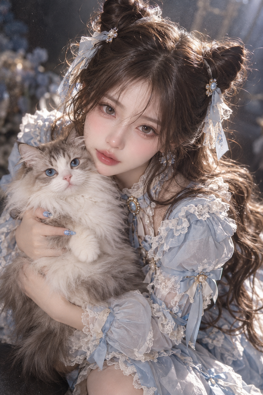
Southeast Asian beautiful girl, cool fair porcelain skin, doll-like exquisite and lovely facial features, breathtakingly gorgeous, waist-length wavy dark brown hair styled into two cat-ear-shaped double buns. She wears a light blue Lolita dress, holding a long-haired cat in her arms, striking a sweet and warm pose against a minimalist backdrop. Shot in a close-up slightly high-angle overlook perspective to boost visual impact and artistic sense. Full emotional atmospheric tone, soft bokeh blur, dim hazy glow, gentle overexposure, shallow depth of field, heavy film grain texture, rich color layers, subtle vignetting edges, freehand stylized dark tone palette, vivid and perfectly balanced hues, abundant intricate details, full natural skin texture. Lit with Rembrandt lighting, rim light on hair, side profile fill light, glossy shiny strands of hair. Ultra-high resolution rendering to capture every facial feature, supremely delicate texture, rendered in sharp 32K pixel clarity, blue manicured fingernails.
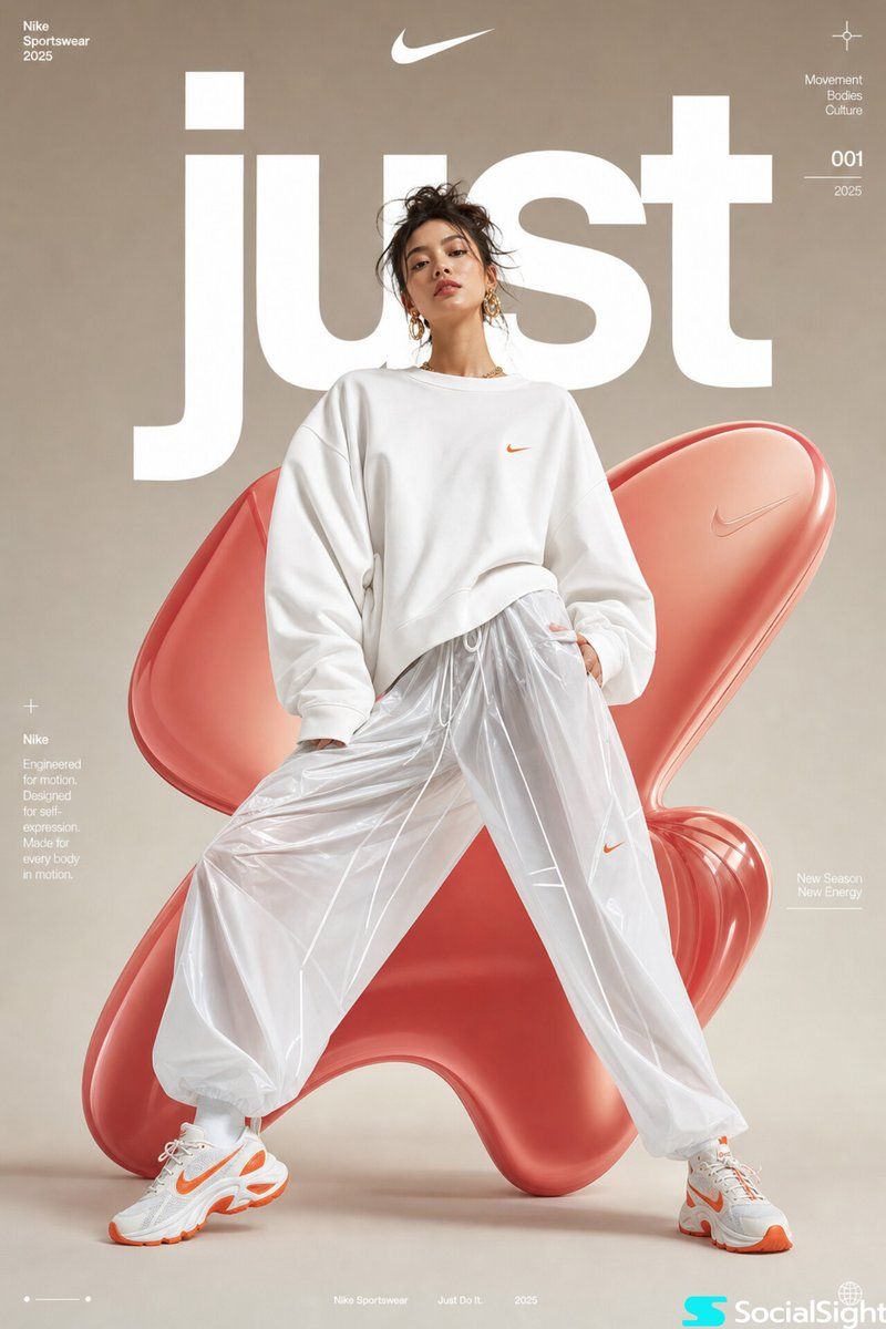
High-fashion futuristic sportswear editorial poster, full-body female model in dynamic wide-leg stance, oversized white minimalist sweatshirt with voluminous sleeves, glossy translucent parachute pants, chunky white-orange athletic sneakers, sleek messy updo hairstyle, gold statement earrings, soft natural makeup, confident editorial expression, studio fashion photography, centered composition, smooth neutral beige gradient background with large abstract glossy red-pink organic 3D inflatable blob shapes behind model, bold oversized white typography “just” partially behind subject, premium athletic brand campaign aesthetic, ultra-clean lighting, soft diffused studio shadows, luxury streetwear advertisement, contemporary magazine cover design, minimalist layout, subtle futuristic graphic microtext, highly polished commercial fashion retouching, sharp focus, cinematic soft contrast, photorealistic, high detail, 8k
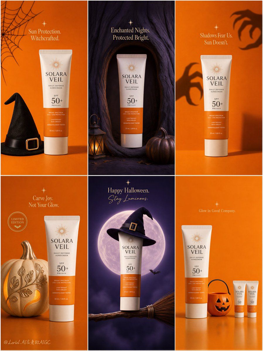
Create a Cannes-level ultra-premium seasonal campaign board for an original sunscreen brand called "SOLARA VEIL", designed as one single vertical poster composed of six equal rectangular panels arranged in a clean 2-by-3 grid. The campaign must preserve a strict modular social-ad structure while evolving into a more elevated, curated, and luxury seasonal release system. Every panel must feel like part of one unified international brand campaign kit, with identical margin discipline, consistent product orientation, unified typography logic, coherent lighting language, and tightly controlled orange-violet palette rhythm. The overall result must feel like a premium Halloween limited-edition packaging launch board rather than a busy holiday flyer. Global campaign structure: Use a perfectly disciplined six-panel grid with narrow clean gutters and strong architectural spacing. Maintain strict consistency across all six tiles: same sunscreen tube design, same logo system, same product angle, same package realism, same shadow behavior, same typographic hierarchy, same restrained premium Halloween identity, and the same visual cadence from panel to panel. Alternate vivid pumpkin orange and deep twilight violet fields in a highly art-directed rhythm, with occasional warm cream highlights and soft black accents. The sunscreen tube must always remain the hero in every tile. Each panel should contain only one core seasonal prop or concept, with significantly increased negative space and reduced visual clutter, so the whole board feels more gallery-like, elevated, and globally deployable. Product design: Design the sunscreen as a premium modern skincare tube with an elegant warm-white body, a sun-orange lower panel, a refined minimalist logotype for "SOLARA VEIL", a clear and beautifully integrated "SPF 50+" mark, subtle premium print texture, realistic cap geometry, tactile soft-matte plastic finish, and clean commercial reflections. The tube must feel globally premium, dermatology-trusted, luxurious, and highly believable. Keep the product front-readable, proportionally accurate, and sharply rendered in every panel. Across the six tiles, preserve a highly consistent product pose and visual scale so the campaign reads like one unified brand system rather than six unrelated posters. Orbit enhancement: Push the campaign toward a flagship brand-identity system. Strengthen the consistency of logo placement, text weight, margin spacing, product angle, and orange-violet chromatic relationship across all six panels so the board feels almost like a visual constitution for the seasonal campaign. Each panel must feel more iconic and distilled, with the sunscreen tube reading as the undisputed center of gravity. The entire board should feel more premium, more coherent, and more memorable, suitable for global rollout across social media, e-commerce, in-store screens, and launch decks. Port transformation: Keep the six-panel skeleton and product-led logic unchanged, but reconstruct the visual world into a more minimal limited-edition packaging release board. Reduce decorative Halloween elements dramatically. Each tile must feature only one central seasonal cue or one highly selective supporting object, paired with the sunscreen tube and generous negative space. Eliminate cute clutter and transform the campaign into a cleaner, more curated, more design-forward expression of seasonal branding. The result should feel like a luxury FMCG seasonal visual system with art-book clarity and collectible packaging energy. Panel 1, top-left: Create a vivid pumpkin-orange flat-lay tile with the sunscreen tube centered or slightly off-center as the hero product. Add only one core seasonal prop, such as a minimal black witch hat or a single refined spiderweb motif. Include one concise premium English promotional line, newly invented and not copied from any source, placed with disciplined spacing and sculptural clarity. The panel should feel bright, graphic, and controlled. Panel 2, top-center: Create a deep twilight-violet tile with the sunscreen tube placed inside a clean magical niche carved into a stylized tree trunk or shadowed vertical form. Use only one or two supporting details, such as one lantern glow and one pumpkin at the base. The atmosphere must feel enchanted but restrained. Add a short premium English seasonal line near the top area with elegant spacing. This tile should feel cinematic, mysterious, and premium rather than crowded. Panel 3, top-right: Create a minimal pumpkin-orange studio tile with the sunscreen tube standing upright in the lower center, while one pair of soft shadow-hands or abstract monster silhouettes reaches subtly across the background wall. Keep everything else stripped back. Use one short English line above or beside the product, integrated into the negative space. The concept should communicate protection through restraint and bold simplicity. Panel 4, bottom-left: Create a soft orange seasonal still life featuring the sunscreen tube beside one single sculptural pumpkin element, decorated in a premium minimal way, such as a clean frosting surface or elegant carved pattern. Add one small circular promotional seal or badge and one concise premium English phrase. The tile should feel festive but editorial, styled more like a luxury holiday release visual than a playful cluttered ad. Panel 5, bottom-center: Create a deep violet fantasy tile with the sunscreen tube hovering above or resting on one refined broom, topped with a single minimal witch-hat accent. Add a softly glowing moon or spotlight disk behind the product. Keep bats and spark elements extremely restrained, at most one or two tiny details. Include one compact elegant English Halloween greeting or campaign line. This tile should feel iconic, graphic, and collectible. Panel 6, bottom-right: Create a minimal orange geometric tile featuring one full-size sunscreen tube and one highly selective accessory such as a single pumpkin bucket, one candy-striped element, or one small lineup of miniature tubes arranged with precise spacing. The layout should feel rhythmically designed and almost packaging-editorial in tone. Use only micro-copy if absolutely needed. This tile should close the board with strong order, wit, and premium restraint. Typography and graphic system: All text across the six tiles must be newly invented, premium, and elegantly restrained. Use English only. The typography system must feel highly unified across all panels: same family logic, same spacing discipline, same hierarchy, same refinement. Blend premium serif display with subtle handwritten or rounded accents only when necessary, but keep the system controlled and minimal. Typography must function as part of the composition, never overwhelming the product, never covering recognition zones, never becoming noisy. The overall text density must be lower than a typical seasonal campaign, with much more breathing room and sharper hierarchy. Lighting and atmosphere: Use premium commercial lighting tailored to each tile while preserving strong overall consistency. Orange tiles should feel studio-clean, warm, and softly radiant. Violet tiles should feel cinematic and moonlit, with refined rim light and gentle ambient glow. In every panel, the sunscreen tube must show impeccable readability, soft glossy highlights, accurate cylindrical form, premium skincare realism, and clean separation from the background. Avoid muddy darkness, flat light, and excessive contrast. Material and prop realism: Every seasonal prop must feel tactile, selective, and impeccably styled: matte pumpkin skin, velvet-dark hat fabric, delicate web texture, brushed broom fibers, softly glowing lantern glass, smooth studio surfaces, and crisp premium packaging plastic. The contrast between minimal festive cues and sophisticated skincare packaging must feel intentional and elegant. Keep the props reduced, clean, and visually quiet. Design intent: The final artwork must feel like a world-class premium sunscreen Halloween campaign board transformed into a curated seasonal brand system. It should balance festive recognizability with luxury restraint, combining six-tile modular clarity, product dominance, refined typography, minimal prop language, and a collectible limited-edition atmosphere. The sunscreen tube must remain the visual leader in every panel. The campaign must feel clever, upscale, highly shareable, and suitable for international brand launch materials. Rendering style: ultra-realistic premium skincare campaign board, six-panel Halloween luxury release system, minimalist seasonal packaging editorial, refined sunscreen packaging realism, orange and violet modular brand world, cinematic product lighting, curated FMCG advertising design, reduced-prop premium social campaign, collectible holiday visual system, 8k, world-class image quality Negative prompt: copied original text, Arabic text, copied source slogan, cheap Halloween flyer, generic pharmacy ad, ugly font, heavy black font, cluttered layout, weak product focus, deformed sunscreen tube, broken cap, unreadable label, malformed letters, low-detail props, messy pumpkins, chaotic decoration, too many bats, too many candy elements, visual noise, muddy purple shadows, flat orange lighting, inconsistent brand system, low resolution, compression artifacts, amateur poster design, human faces, hands, extra people